A grammar of graphics for comparative genomics
gggenomes is a versatile graphics package for comparative genomics. It extends the popular R visualization package ggplot2 by adding dedicated plot functions for genes, syntenic regions, etc. and verbs to manipulate the plot to, for example, quickly zoom in into gene neighborhoods.
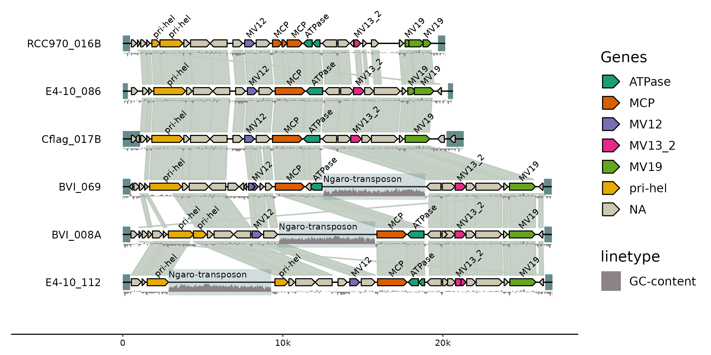
A realistic use case comparing six viral genomes
gggenomes makes it easy to combine data and annotations from different sources into one comprehensive and elegant plot. Here we compare the genomic architecture of 6 viral genomes initially described in Hackl et al.: Endogenous virophages populate the genomes of a marine heterotrophic flagellate
library(gggenomes)

# to inspect the example data shipped with gggenomes
data(package="gggenomes")

gggenomes(
  genes = emale_genes, seqs = emale_seqs, links = emale_ava,
  feats = list(emale_tirs, ngaros=emale_ngaros, gc=emale_gc)) |>
  add_sublinks(emale_prot_ava) |>
  sync() + # synchronize genome directions based on links
  geom_feat(position="identity", size=6) +
  geom_seq() +
  geom_link(data=links(2)) +
  geom_bin_label() +
  geom_gene(aes(fill=name)) +
  geom_gene_tag(aes(label=name), nudge_y=0.1, check_overlap = TRUE) +
  geom_feat(data=feats(ngaros), alpha=.3, size=10, position="identity") +
  geom_feat_note(aes(label="Ngaro-transposon"), data=feats(ngaros),
      nudge_y=.1, vjust=0) +
  geom_wiggle(aes(z=score, linetype="GC-content"), feats(gc),
      fill="lavenderblush4", position=position_nudge(y=-.2), height = .2) +
  scale_fill_brewer("Genes", palette="Dark2", na.value="cornsilk3")

ggsave("emales.png", width=8, height=4)
For a reproducible recipe describing the full evolution of an earlier version of this plot with an older version of gggenomes starting from a mere set of contigs, and including the bioinformatics analysis workflow, have a look at From a few sequences to a complex map in minutes.
Motivation & concept
Visualization is a corner stone of both exploratory analysis and science communication. Bioinformatics workflows, unfortunately, tend to generate a plethora of data products often in adventurous formats making it quite difficult to integrate and co-visualize the results. Instead of trying to cater to the all these different formats explicitly, gggenomes embraces the simple tidyverse-inspired credo:
- Any data set can be transformed into one (or a few) tidy data tables
- Any data set in a tidy data table can be easily and elegantly visualized
As a result gggenomes helps bridge the gap between data generation, visual exploration, interpretation and communication, thereby accelerating biological research.
Under the hood gggenomes uses a light-weight track system to accommodate a mix of related data sets, essentially implementing ggplot2 with multiple tidy tables instead of just one. The data in the different tables are tied together through a global genome layout that is automatically computed from the input and defines the positions of genomic sequences (chromosome/contigs) and their associated features in the plot.
Inspiration
gggenomes draws inspiration from some brilliant packages, in particular:
- gggenes by David Wilkins
- ggtree by Guangchuang Yu
- ggraph by Thomas Lin Pedersen
Installation
gggenomes is available as stable release on CRAN (from v1.0.1). The latest developmental versions are available on github.
# Install from CRAN
install.packages("gggenomes")

# optionally install ggtree to plot genomes next to trees
# https://bioconductor.org/packages/release/bioc/html/ggtree.html
if (!requireNamespace("BiocManager", quietly = TRUE))
    install.packages("BiocManager")
BiocManager::install("ggtree")

# Install latest developmental version from github
devtools::install_github("thackl/gggenomes")